Typesetting tip to achieve the best looking Drop Cap in indesign
Words &&& Creative Ltd | 25/4/2015 | Tag: Design Ideas
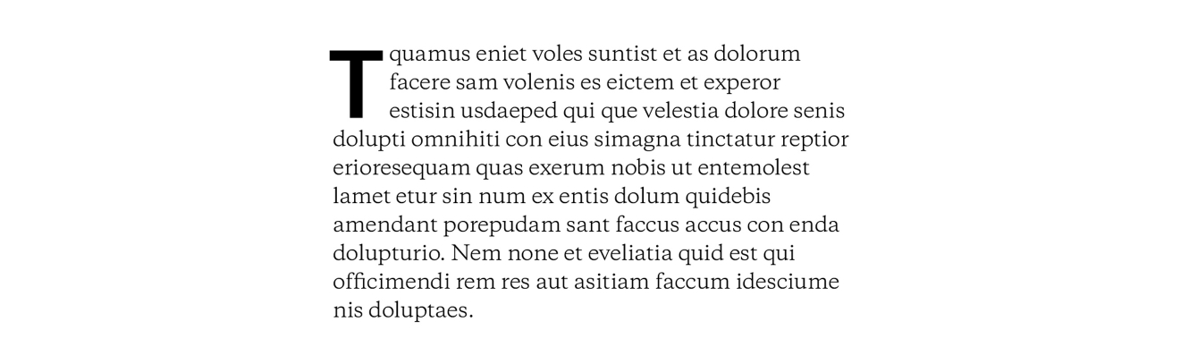
The almighty Drop Cap is a wonderful tool in the armory of a graphic designer. Breaking text-heavy pages whilst adding clear entry points for readers. At large scales it becomes a typographic ornament. However time and time again we see it set incorrectly, with the Drop Cap not being optically aligned to the text or the tracking after the drop cap not set. Resulting in the space between the drop cap and main copy being very tight. These are the typical issue’s you will face as a designer when using the automatic settings within indesign. Depending on the typeface and the context there are numerous ways to resolve these issue’s.
We have approached many complex editorial where we have made great use of Drop Cap’s such as AWP’s Nine signature books to Life in Heathrow City for Hawkins\Brown. We therefore thought it would be nice to share our design tip so we can all set the perfect Drop Cap.
We hope your enjoy our design tip, which will have you typesetting the perfect Drop Cap in no time.
Setting the Drop Cap Manually
This is ideal for beginners and will give you a good insight into the technical process of setting a Drop Cap. Along with spotting the issues highlighted above.
Setting the Drop Cap with Paragraph and Character styles
Once you have mastered the manual process we recommend expanding your knowledge and getting to grips with inDesign styles. This is very useful when setting multiple Drop Caps inside a document.
Setting the Drop Cap Manually

1.Select the first character in your paragraph

2. Set the amount of lines you want it to extend over to 3 > then select the amount of characters that will be converted into Drop Caps to 2 (A good rule of thumb for an initial Drop Cap is a minimum 6 Line)

3. Here you will see that the first 2 characters have now been converted into Drop Caps
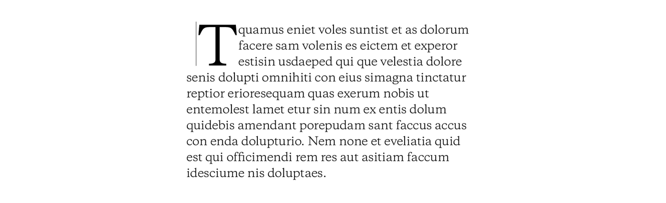
4. Put the cursor before the first character of the paragraph and hit space bar. The space now adopts the Drop Cap styling, pushing the other characters along 1
5. You now want to highlight the space with Drop Cap styling applied to it

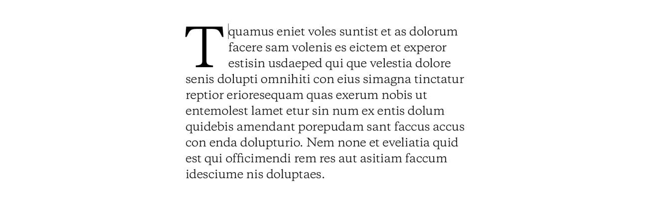
6. Reduce the Tracking to shift the Drop Cap over to the left

7. Use a ruler to line it up properly or just do it optically

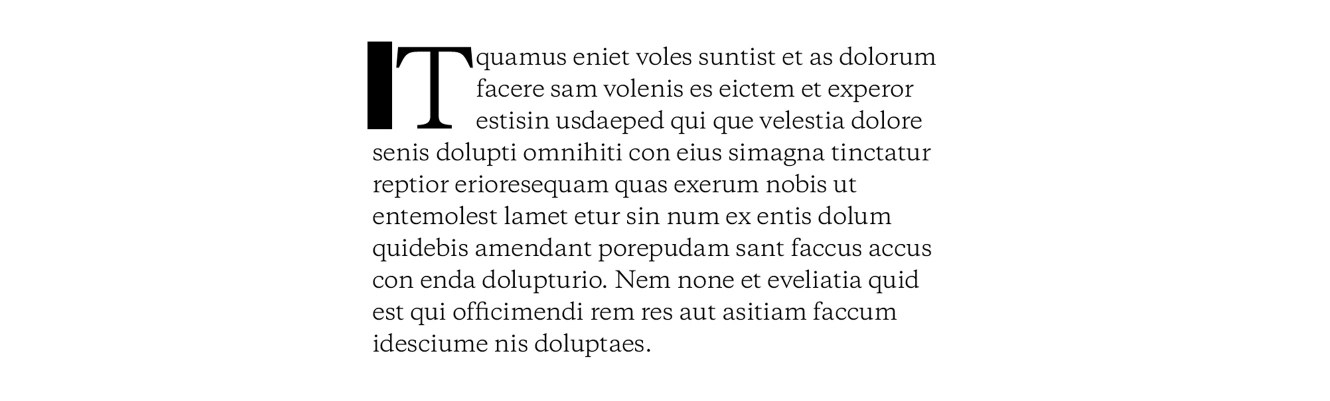
8. Select the other side of the Drop Cap > Increase the Kerning to move the rest of the text to the right. A good rule of thumb is 30pt for your kerning. However this is dependent on the typeface used.
9. Here you can see the paragraph has shifted to the right
10. Change the Drop Cap to a different font if you want it to stand out. Don’t forget to set it in registration black if you’re dealing with large black characters/shapes
Setting the Drop Cap with Paragraph and Character Styles

1. Select the first character in your paragraph

2. Make a new character style by going to Window > Styles > Character Styles. This will open the character styles dialogue box
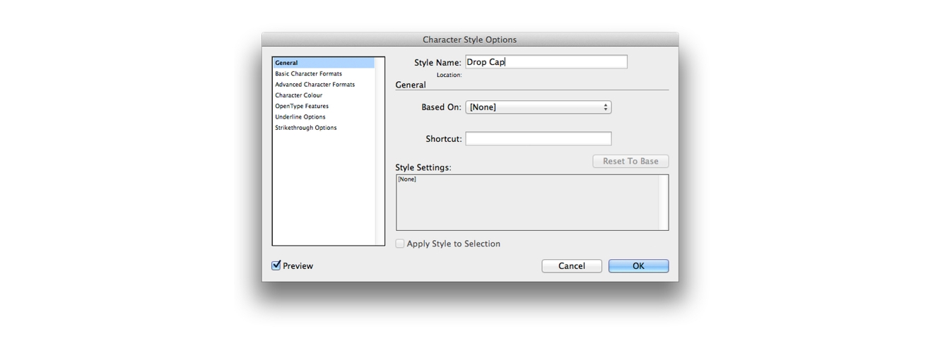
3. Double click the character style and rename it to ‘Drop Cap’
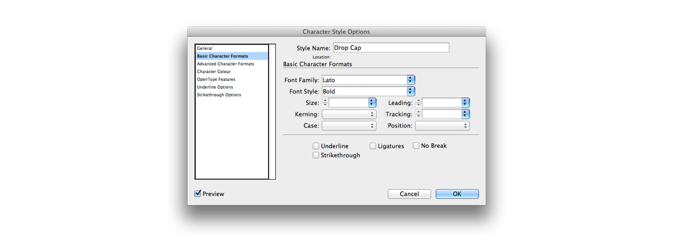
4. Change to a desirable font for your Drop Cap

5. Add a new paragraph style by going to Window > Styles > Paragraph Styles.
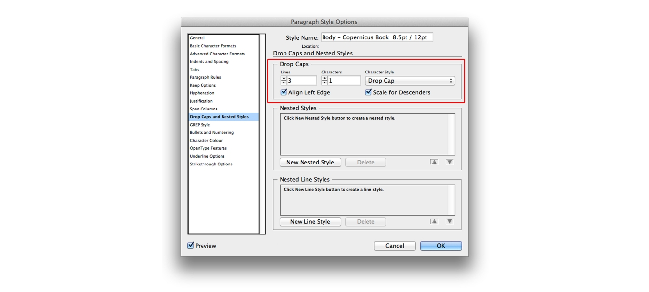
6. Under drop caps and nested styles change the drop cap settings and select the character style you setup ‘Drop Cap’. Tick the optically align field, this will align the drop cap to your paragraph style.

7. Almost there! As you can see that the type is too tight to the text..
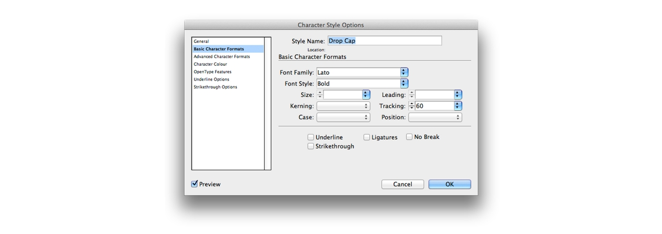
8. Open up your character style and alter the tracking in there. A good rule of thumb is 30pt for your tracking. However this is dependent on the typeface used. Once you are happy click ok.

9. There you go! If you want to alter the Drop Cap further then make the changes in your character style. If you use these styles across a large publication you can update them with a few simple adjustments inside the Character style. From colour to tracking to font.
We hope you enjoyed our tip, happy Drop Caping.
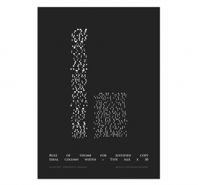
If you found this useful check out our Our typographic tip poster, helping your justified copy look good