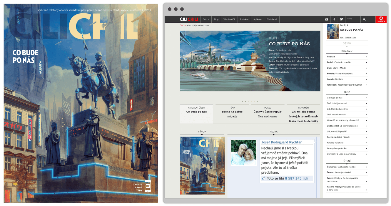
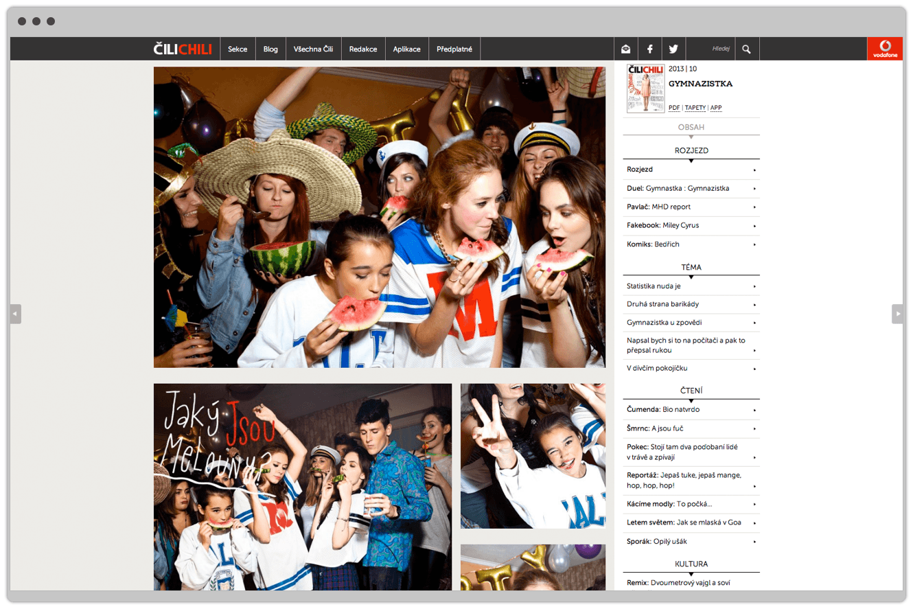
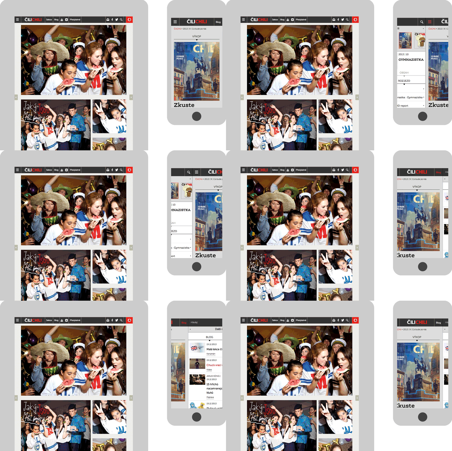
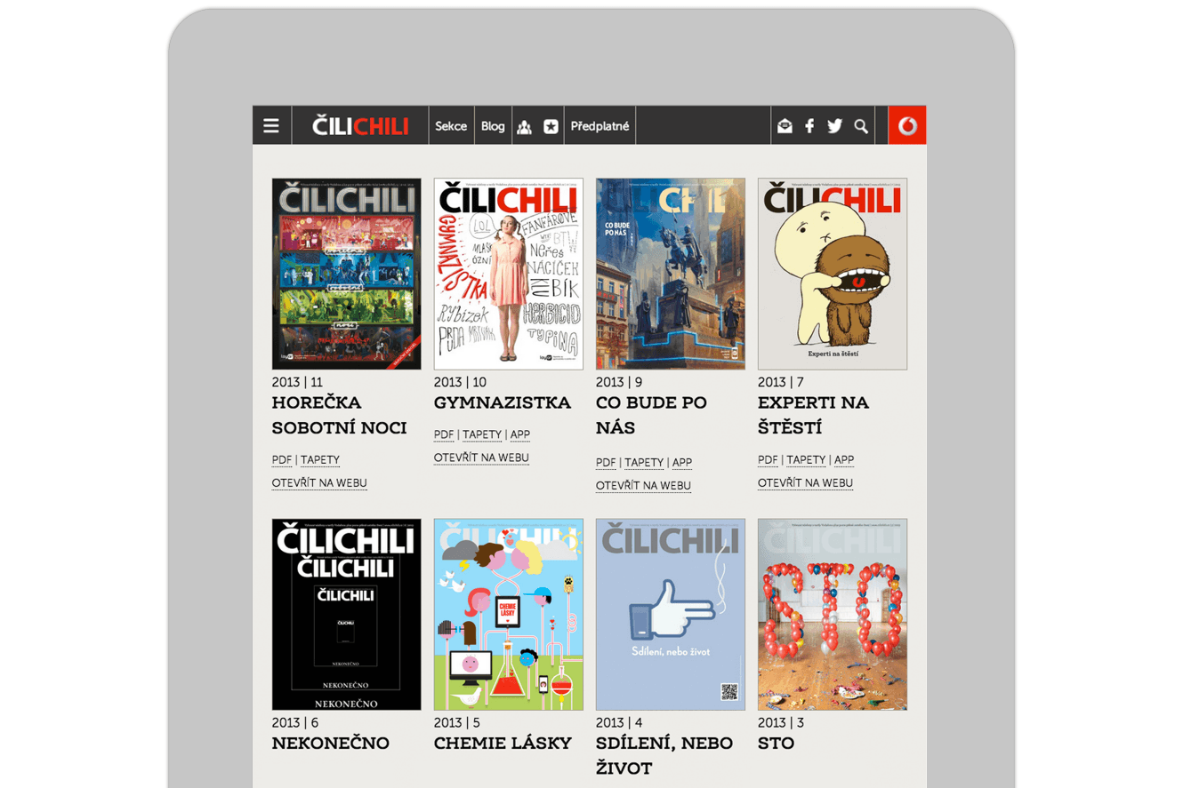
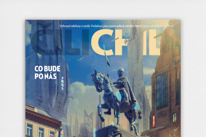
The website design and development stretched: current adaptive technology, remodeled website content structures and embraced contemporary content delivery systems. Turning the question on its head “How do we as an industry take print online?”
The website design is a seminal building block of a marketing strategy to unify the brand experience of Cilichili across print and digital. Achieved through developing a set of design principles that work online and in print to create dynamic adaptive layouts, delivering the best reading experience. Highly flexibly page templates house Cilichili’s humorous content in a myriad of formats, allowing authors to ultimately design online.
Taking print online requires an understanding of publishing and the simple fact ‘issues’ are an integral part of a magazines cycle. As an audience they define how we: find content, remember content and anticipate the new. We remodeled conventional website content structures so we could achieve simultaneous publishing across print and digital. Allowing users to click through the site by issue or articles, as simple as turning a page.
Capitalising on the power of digital, where more than more is possible, we where able to; deliver more of what the audience likes, develop a media a rich environment and entertain through a daily blog. This would allow online editors full control to showcase everything right down to individual authors to most read articles to most shared articles and much more.
Website Design Build: WordPress, html5, CSS3, Webfonts, JQuery
Content Delivery: Issuu, YouTube
Social Media Engagement: Facebook, Google+, Twitter, Mailchimp, Livefyre, Add This
